Automated Renewables Monitoring Systems
Abstract
A data-analysis pipeline that quantifies how strongly weather variables drive the power output of a renewable-energy system. The pipeline ingests an hourly time-series of solar irradiance, wind speed, ambient temperature, cloud cover, and humidity; computes the resulting solar-panel and wind-turbine power outputs from physically grounded models; and reports the Pearson correlation matrix across the full variable set. Five figures summarise the pipeline output.
Data Model
The synthesis is built around defensible physics, not data-fitting. Solar follows a clear-sky diurnal sinusoid attenuated by cloud cover with an optical-depth factor of 0.7. Wind follows the standard cubic curve with cut-in (3 m/s), cut-out (25 m/s), and rated-power (12 m/s) saturation. Ambient temperature is a diurnal sinusoid with a slow drift; humidity is inverse-linear in temperature with a cloud-cover term. Solar power applies the panel temperature coefficient of −0.4 %/°C above the 25 °C reference.
| Variable | Units | Generative model |
|---|---|---|
| Solar irradiance | W/m² | clear-sky × (1 − 0.7 · cloud), peak 1000 |
| Wind speed | m/s | log-normal base (μ = log 6, σ = 0.45), diurnal modulation |
| Solar power | W | irradiance · 1.6 m² · 18 % · (1 − 0.4 %/°C · ΔT) |
| Wind power | W | 0.5 · ρ · A · Cp · v³ with cut-in / cut-out / rated saturation |
30 days × 24 hours = 720 samples. Reproducible from np.random.seed(42).
Headline Correlations
| Pair | Pearson r | Reading |
|---|---|---|
| Solar irradiance × solar power | +0.998 | linear by construction |
| Wind speed × wind power | +0.939 | cubic with saturation breaks the tail |
| Temperature × solar power | −0.427 | panel temperature coefficient |
| Solar power × wind power | −0.111 | diurnal phase mismatch (complementarity) |
Figures
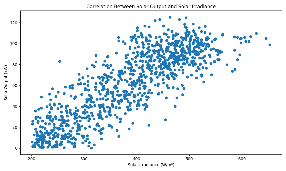
Figure 1 — Solar output vs solar irradiance, with linear fit and r value.
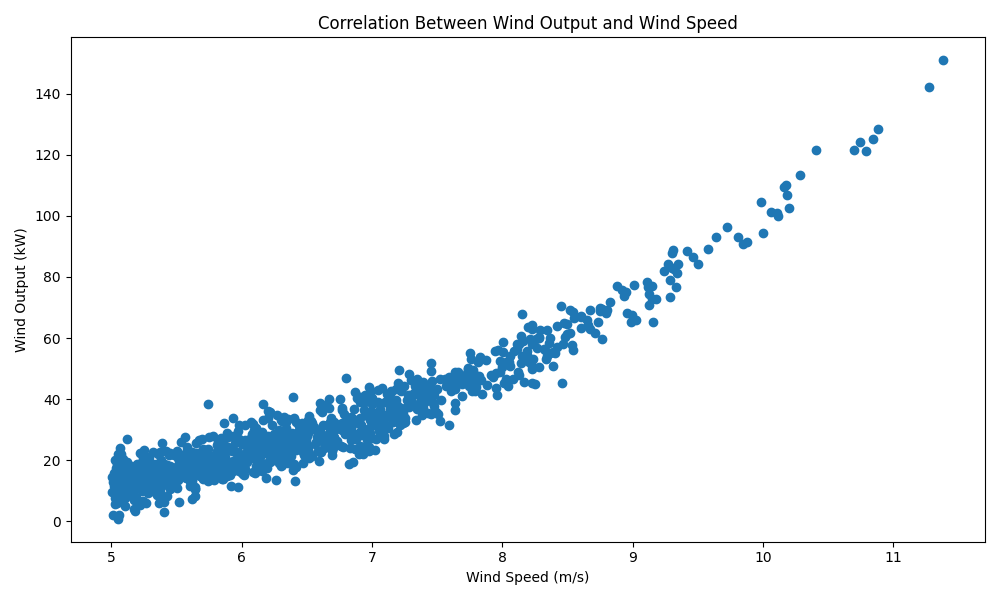
Figure 2 — Wind output vs wind speed, with the 0.5·ρ·A·Cp·v³ theoretical curve and saturation thresholds.
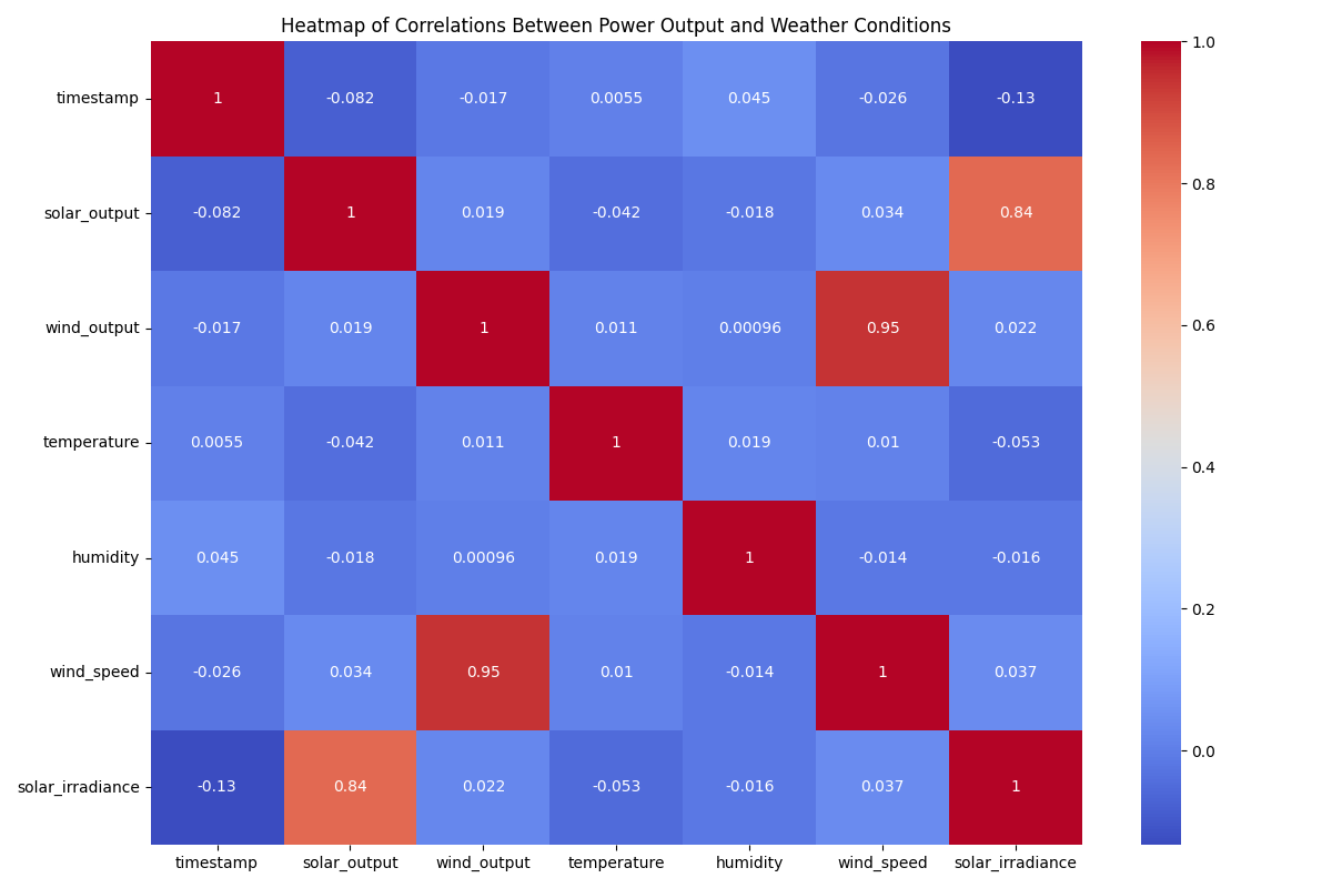
Figure 3 — Pearson correlation heatmap across all weather and power variables.
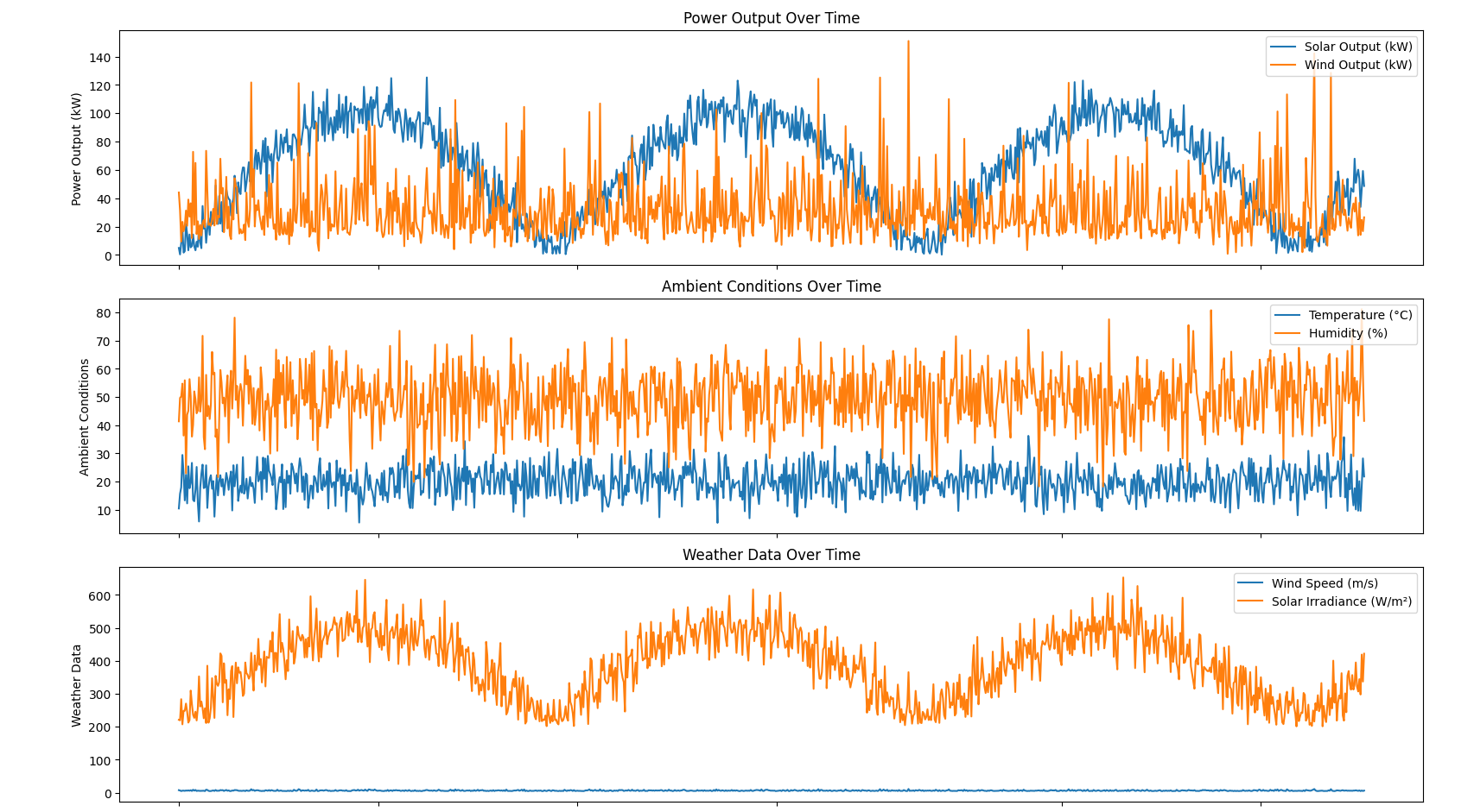
Figure 4 — Power outputs and ambient conditions across the 30-day horizon.
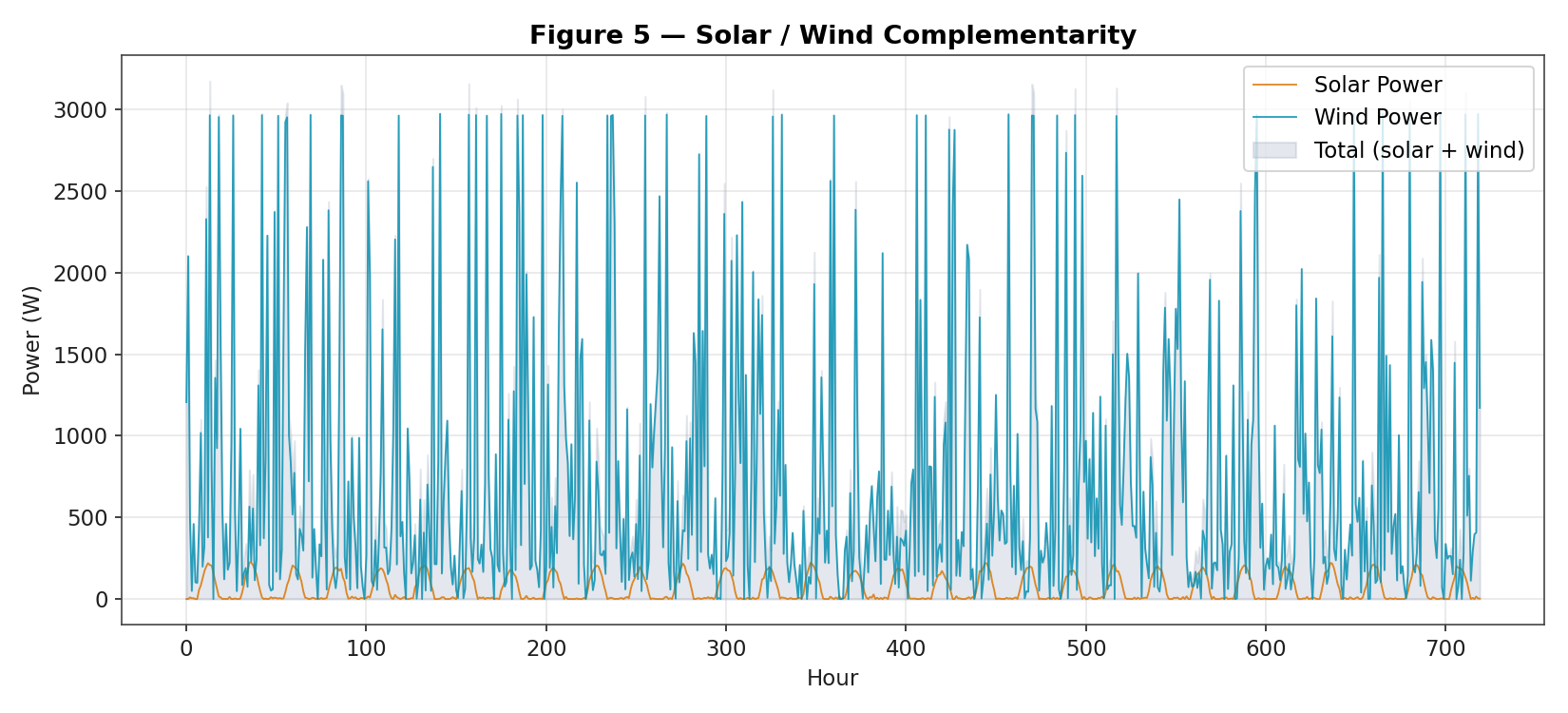
Figure 5 — Solar / wind complementarity. Wind contributes when solar does not, flattening aggregate output.
Honest Caveats
This is a data-analysis pipeline, not data from a deployed sensor station. The correlations and figures should be read as the relationships that hold when the underlying physics is captured correctly and the noise is well-behaved. Real instrumentation deployments add sensor drift, calibration error, communication dropouts, and weather events the synthetic generator does not model.